Experiment Analysis
Once you have started to collect data on some experiments, you'll want to start reviewing the results! Eppo allows you to see experiment results across multiple experiments, zoom in on a specific experiment, estimate global impact, and then slice and dice those results by looking at different segments and metric cuts.
Viewing multiple experiments
When you click on the Experiments tab of the Analysis section, you will see the experiment list view, which shows all of your experiments. You can filter this list by experiment name, timeframe, status, entity, team, creator, primary metric, or just show experiments you have starred.
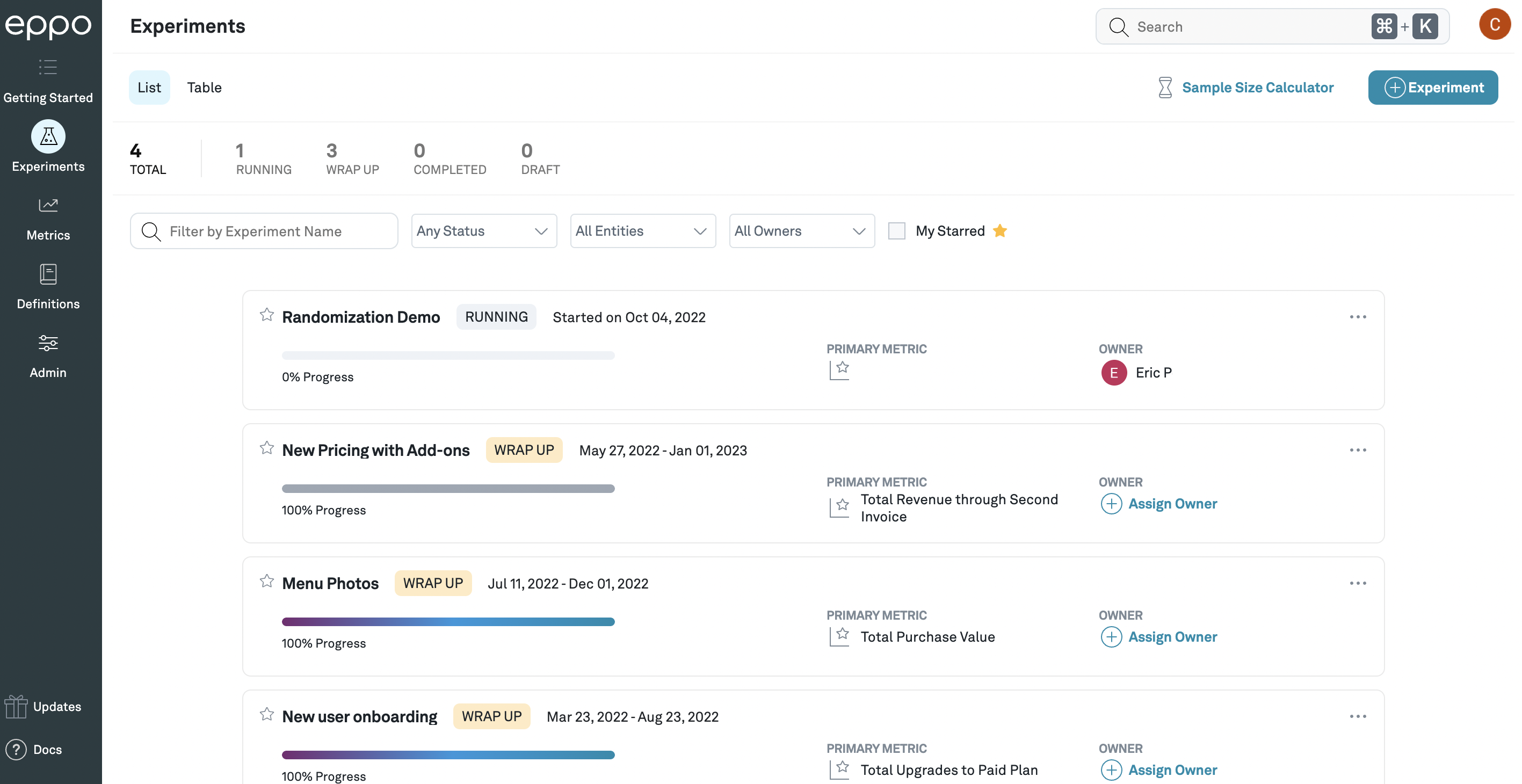
The experiment list view, showing a list of experiments that can be filtered and searched.
Overview of an experiment's results
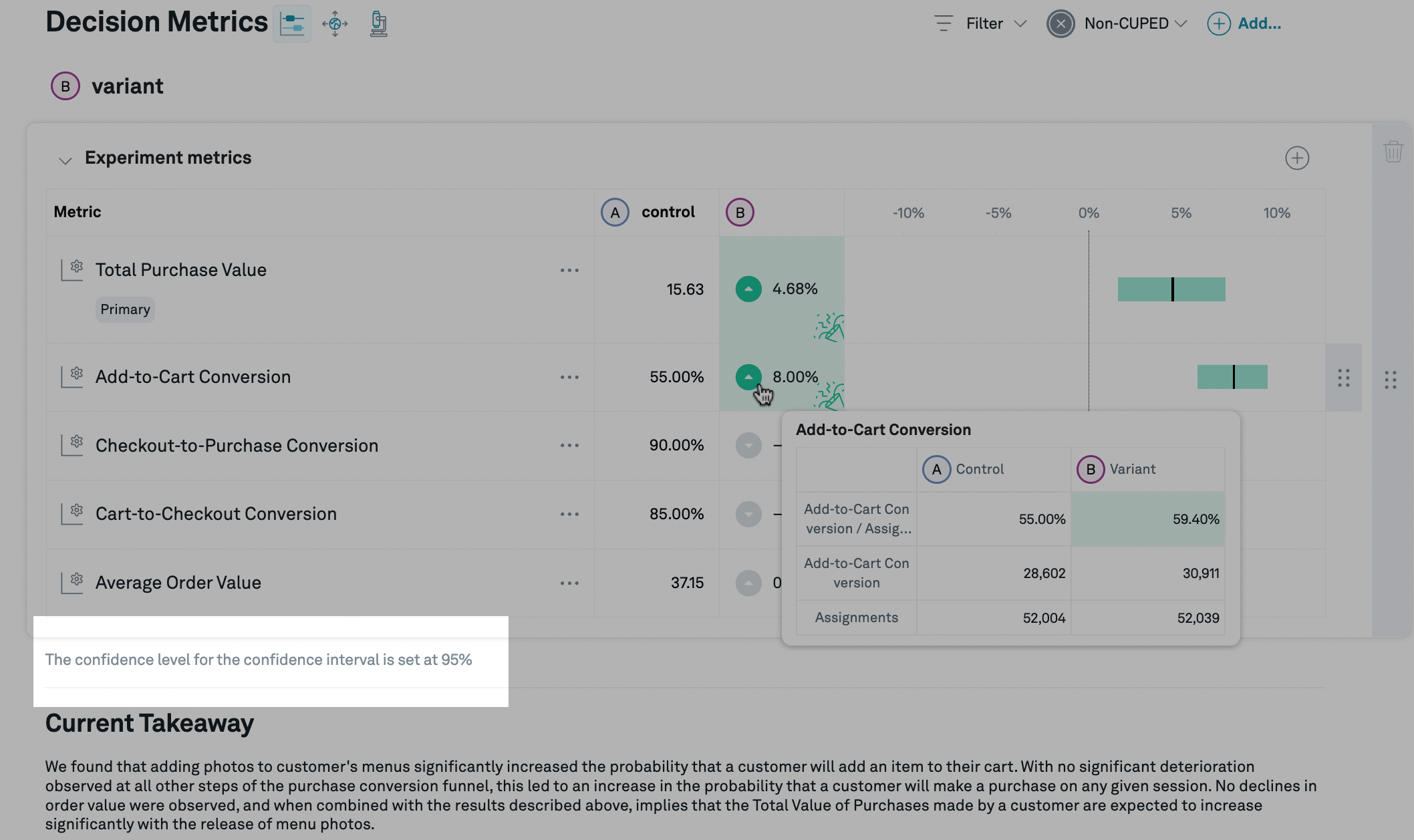
Clicking on the name of an experiment will take you to the experiment detail view, which shows the effects of each treatment variation, compared to control. Within each variation, for each metric that you have added to the experiment, we display the (per subject) average value for the control variation, as well as the estimate of the relative lift (that is, the percentage change from the control value) caused by that treatment variation.
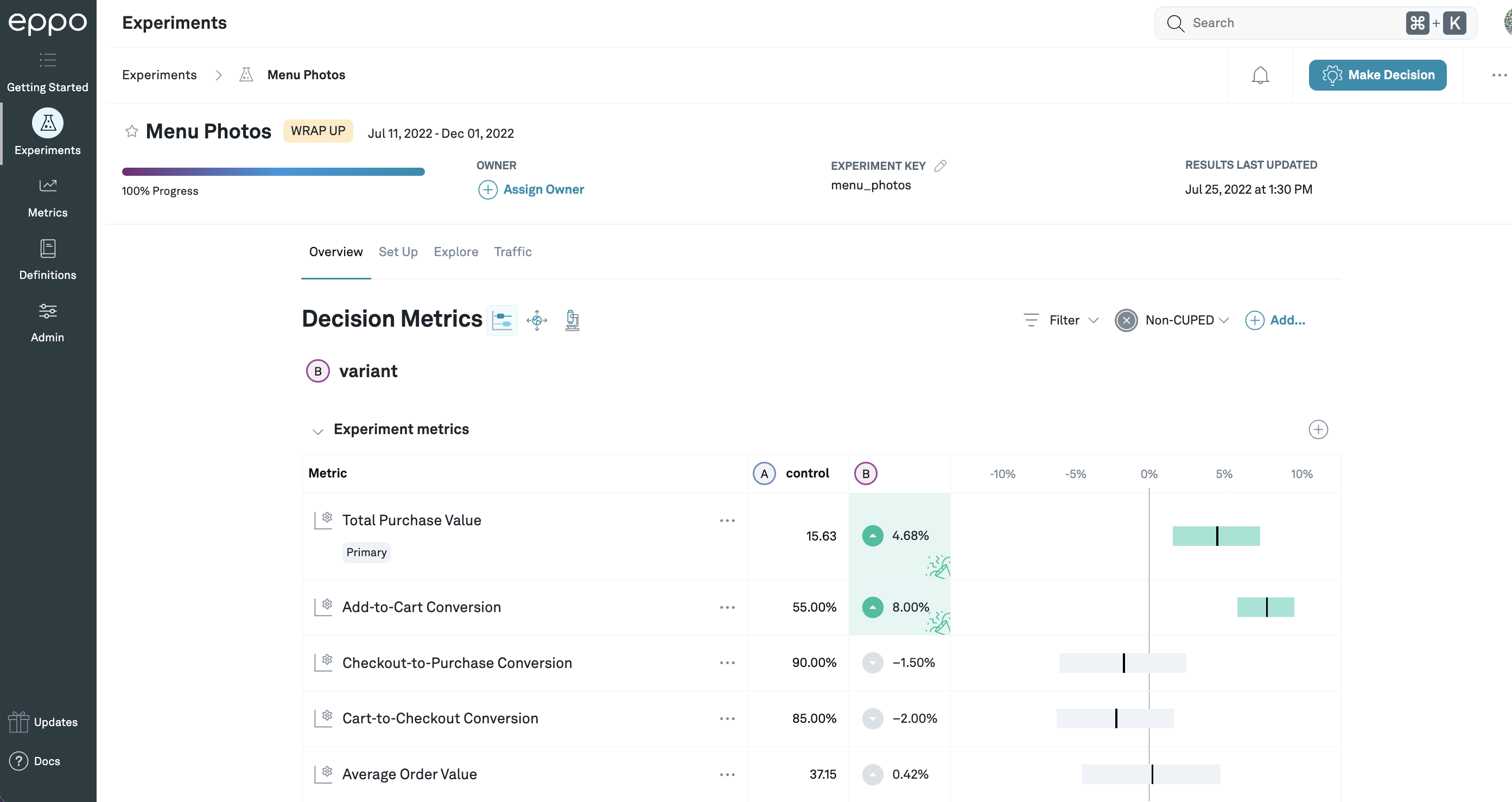
In this example, the control value of Total Purchase Value is
15.63 (per subject), and variation B is estimated to increase that by 4.68%.
For Add-to-Cart Conversion, the control value is 55%, because it has been set to
display as a percentage, and the lift is 8%: this means that the add-to-cart
conversion rate that would be expected from shipping the treatment
is 108% times the control rate of 55%, that is, 59.4%.
If you hover over the lift, you can see the metric values for both control and treatment variations, as well as the sum of the underlying fact(s) and the number of subjects assigned to each variation.
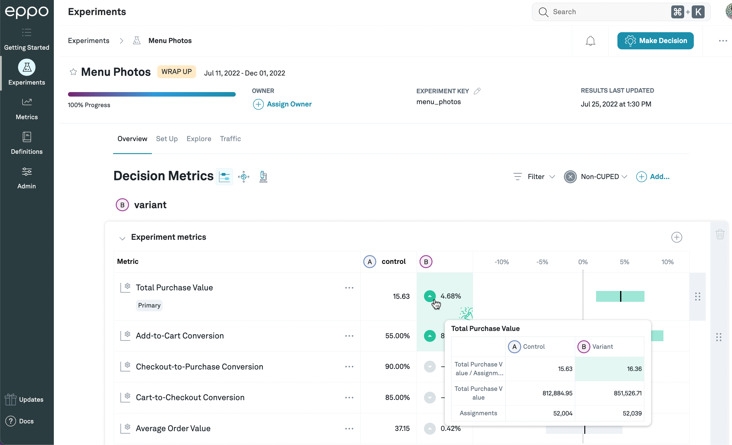
In this example, the total purchase value per assigned subject is 15.63 for control and 16.36 for treatment, and the total purchase value across all assigned subjects is 812,884.95 for control and 851,526.71 for treatment. There are 52,004 subjects assigned to control, and 52,039 assigned to treatment.
Depending on the metric settings, we may cap outliers in the raw data in order to improve the quality of our lift estimates, and so the average and total values displayed in this popover might differ from those displayed in other tools.
In addition, in many cases (in particular, if CUPED is enabled), we perform additional processing on the data before estimating the lift (such as correcting for imbalances across variations along different dimensions). For this reason, the lift displayed on the details page may not match the lift calculated directly from the numbers in this popover.
See Basics of estimating lift for more information on how we estimate lift in different circumstances.
To the right of the details page, we display the estimated lift graphically as a black vertical bar, as well as a confidence interval that shows the values of the lift that we consider plausible given the observed data from the experiment. The precise definition of plausible is determined by, among other things, the confidence level, which defaults to 95%: we set the lower and upper bounds of the confidence interval such that it will contain the true lift at least 95% (or whatever confidence level you've selected) of the time.1 In addition, Eppo has several different methods for calculating the confidence intervals, which can be set at the company or experiment level.
Randomly allocating users to each variation means that the lift we observe in the experiment data should be a good estimate2 of the lift you would observe if you shipped the treatment. However, any time you estimate something for a whole population using measurements from just a portion of that population (in this case, the subjects in the treatment variation), there's a risk that the sample you chose to observe behaves differently from the population as a whole. Specifically, there's always a chance that a bunch of really active subjects, instead of being evenly split across variations, happened to end up concentrated in the control variation or the treatment variation; that would mean that the lift you observed in the experiment would be lower or higher, respectively, than what you'd observe if you shipped the treatment. This is the uncertainty represented by the confidence interval.3 (This is why CUPED, which corrects some of this imbalance, can often greatly reduce the width of the confidence intervals.)
If you hover over the confidence interval, you will see precise values for the upper and lower bounds for this confidence interval:
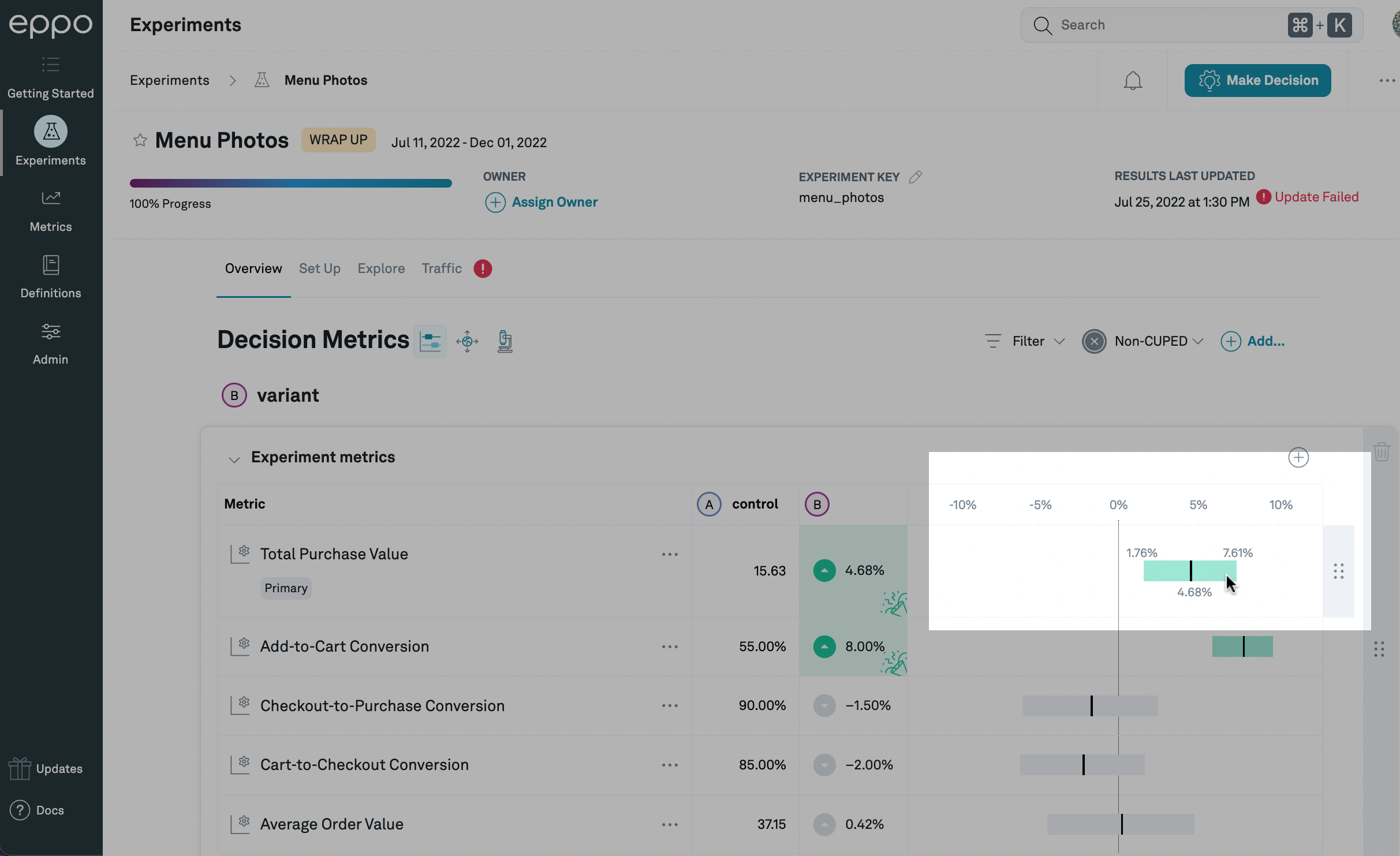
In this case, based on our statistical analysis of the experiment data, our best estimate of the lift caused by this treatment is 4.68%, and we are 95% confident that the lift is between 1.76% and 7.61%. Since a lift of 0% does not fall within that range, the confidence interval is highlighted in green.
If the confidence interval is entirely above or below zero, it means that the data is consistent with the treatment moving the metric up or down, respectively. In this case, the confidence interval bar itself, as well as the lift estimate, will be highlighted green if the movement is good (in which case there will also be a 🎉 symbol in the lift estimate box), and red if the movement is bad.
In general, a positive lift will be good (colored green) and a negative lift will be bad (colored red). However, for metrics such as page load time or app crashes, a higher number is bad. We call these reversed metrics. If you've set the "Desired Change" field in the fact definition to "Metric Decreasing", then positive lifts will be in red and negative lifts will be in green.
The confidence level is set as part of the analysis plan, and you can change the company-wide default on the Admin tab or set an experiment-specific confidence level on the experiment Set Up page. The confidence level being used for any experiment is displayed on the experiment detail page below the table of metric results:
The confidence level is displayed at the bottom of the metric results table.
Multivariate comparisons
By default, Eppo groups by variation first and shows all metric result for a given variation together. As an option, you can also choose to view "By Metric" which groups by metric first and shows how all variants compare to Control for each metric.
To toggle views, simply choose the "By Metric" option from the View dropdown.
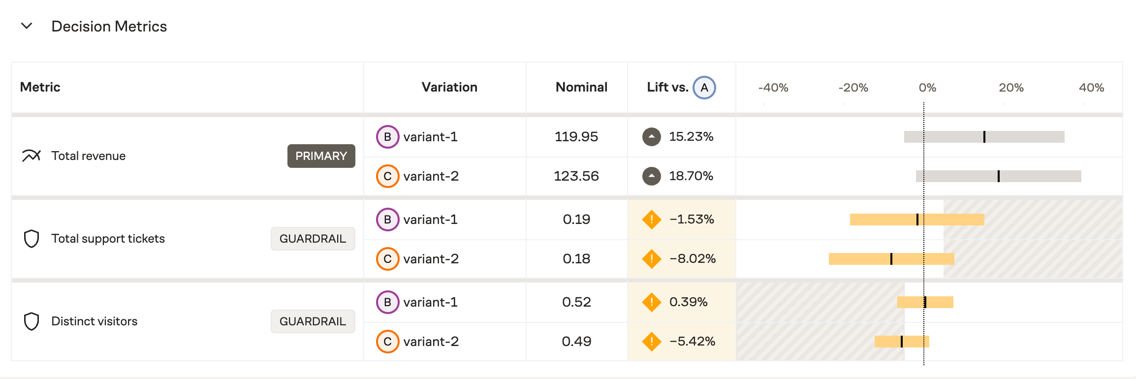
This example shows results broken out by metric, allowing for multivariate comparisons at a glance.
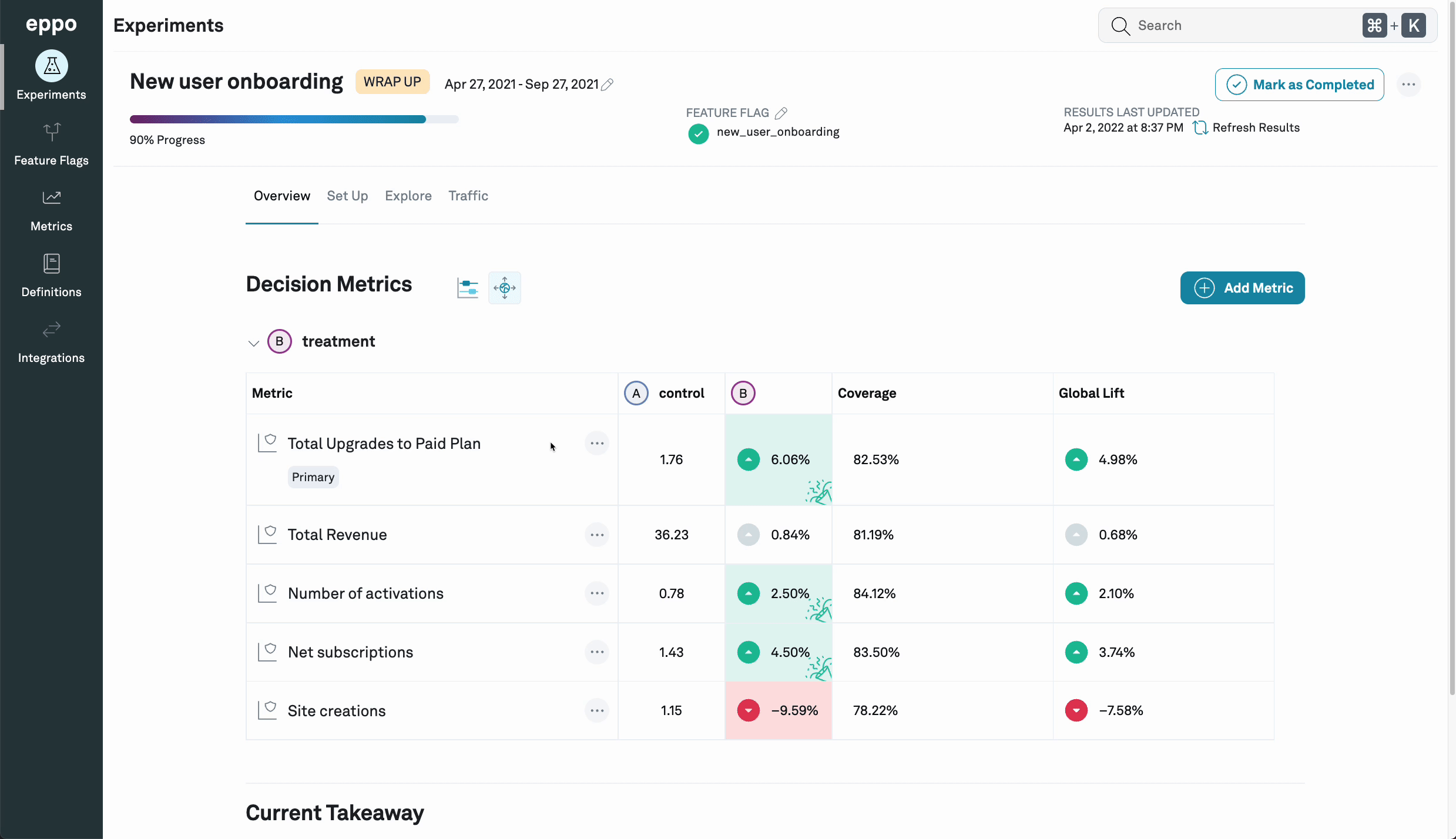
Impact accounting
The main Confidence intervals tab (![]() )
displays the experiment results observed for subjects in the experiment,
but you may want to understand the treatment effect globally; a large
lift in an experiment that targets a tiny portion of your users might have a
negligible business impact.
)
displays the experiment results observed for subjects in the experiment,
but you may want to understand the treatment effect globally; a large
lift in an experiment that targets a tiny portion of your users might have a
negligible business impact.
You can click on the Impact accounting
icon (![]() )
to show, for each metric,
the coverage (the share of all events that are part of the
experiment) and global lift (the expected
increase in the metric if the treatment variation were rolled out to 100%, as a
percentage of the global total metric value).
)
to show, for each metric,
the coverage (the share of all events that are part of the
experiment) and global lift (the expected
increase in the metric if the treatment variation were rolled out to 100%, as a
percentage of the global total metric value).
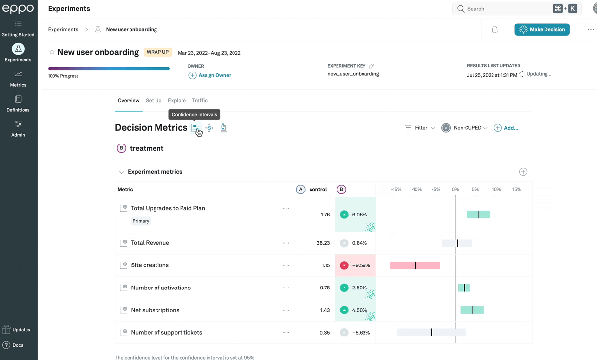
In this example, the impact accounting view shows that, since the experiment has been
active, only 81.8% of Total Upgrades to Paid Plan events were done by subjects
that had been assigned to any variation in the experiment. This means that, while
the lift among subjects in the experiment is 6.06%, since 18.2% of
events are done by subjects who would not have been affected by the treatment,
the top-line number of upgrades is only expected to go up by 4.93%.
Statistical details
In general, the confidence intervals will provide the information you need to
make a ship/no-ship decision. However, if you want to see additional statistical
details, you can click on the Statistical details
icon (![]() ) to display
them. The actual values being shown will differ based on which
analysis method
is being used:
sequential and fixed-sample methods will show the frequentist statistics, while
Bayesian statistics will differ to reflect the different decision-making
processes compatible with that method.
) to display
them. The actual values being shown will differ based on which
analysis method
is being used:
sequential and fixed-sample methods will show the frequentist statistics, while
Bayesian statistics will differ to reflect the different decision-making
processes compatible with that method.
This example shows frequentist statistics, described in detail below.
Frequentist statistics
Frequentist analysis methods (that is, sequential and fixed-sample) will show the following three statistics:
-
Standard error: The standard error of the lift, expressed in percentage points.
-
p-value: The p-value represents the likelihood that an A/A test (that is, an experiment where the treatment is identical to the control) would produce a lift of a magnitude (that is, ignoring the sign) at least as large as the one observed in the data. The p-value directly corresponds to the bounds of the confidence interval: if your confidence level is 95%, for example, a p-value less than 0.05 (that is, ) means that the confidence interval around the lift will just exclude zero.
-
Z-score: Also called the standard score, the Z-score represents how far away the observed lift is from zero, measured as a number of standard deviations. The Z-score is simply a transformation of the p-value: it provides no additional information, but it is sometimes easier to use, particularly when the p-value is very small.
Bayesian statistics
Bayesian methods rely on a different way of thinking about probabilities, and thus use different statistics to summarize the results of an experiment.
-
Probability Beats Control: The probability that the treatment variation is superior to the control variation; in other words, the chance that the lift is good (positive for most metrics, but negative for reversed metrics (e.g. latency: lower latency is better)
-
Probability > Precision: Bayesian analyses comparing two distributions (in our case the average metric values in the treatment variation compared to the average metric values in the control variation) sometimes refer to the Region of Practical Equivalence (ROPE), which is the amount of difference between the distributions that is, practically speaking, trivial. In other words, we might care not just about whether the treatment is strictly better than control, but whether it is better enough that the difference is meaningful (in business terms). Since the precision represents the smallest lift that the business cares about, it is also a useful boundary for the ROPE.
For example, if the precision for a metric was a 5% lift, this statistic would calculate the portion of the posterior lift distribution that is above 5% (assuming positive lift is good).
-
Risk: The expected metric lift (measured in lift terms, that is, as a percentage of the control value) if the lift were in fact negative: (or, for reversed metrics, positive). In other words, even if the bulk of the distribution indicates that the treatment is better than control, some portion is going to be on the other side: there's some chance that in fact control is better than treatment. The risk measures, in that case, what the expected value (that is, the average of all lifts weighted by their likelihood under the posterior distribution) of the lift would be.
-
Loss: The expected value of the loss function (reversed for reversed metrics). Note that this is the same as the probability control beats treatment multiplied by risk.
Segments and filters
You are able to filter experiment results to specific subgroups by selecting the filter menu at the top right corner. We provide two distinct options to filter results.
Segments
Segments are pre-specified subsets of users based on multiple attributes. For example, you might have a "North America mobile users", created by filtering for Country = 'Canada', 'USA', or 'Mexico', and Device = 'Mobile'. You can then attach such a segment to any experiment and Eppo pre-computes experiment results for such a subgroup.
Note that when you first add a segment to an experiment, you have to manually refresh the results to compute the results for the segment.
Single property filter
For quick investigations, we also provide the single property filter: here you can select a single property (e.g. Country) and single value (e.g. 'USA'). These results are available immediately -- no need to manually refresh the results.
Explores
You can also further investigate the performance of an individual metric by clicking on navigator icon the next to the metric name. This will take you to the Metric explore page where you can further slice the experiment results by different properties that have been configured, for example user persona, or browser, etc.
Footnotes
-
For more on how we define confidence intervals, how to interpret them, and a precise technical definition of what it means to be "X% confident", see Lift estimates and confidence intervals. ↩
-
In technical terms, it is consistent, meaning that it gets closer to the true lift as the number of subjects in the experiment increases. ↩
-
Note that there are other sources of uncertainty that are not included in how the confidence interval is calculated. For example, if you start your experiment in June, but don't ship it until December, the behavior of users after being exposed to the treatment in production may be very different from the behavior observed during the experiment: there may be seasonal differences in how users react to the treatment, perhaps; there may be external circumstances (like trends, or different economic conditions) that have changed and affect how users react to the treatment; or (especially if your product is growing and adding more and more users) the users that use the product in December might be different than those that were part of the experiment in June. ↩